One of the things I liked best about the house was the clean, cool finishes and the sleek, medium-brown oak floors. The whole place was painted in icy blues and grays, and the door handles, light fixtures, outlet covers and light switches were done in brushed nickel and stainless. Of course, all of these things can be changed inexpensively and easily, but it was impressive to see a new rehab done in such a modern way.

The pale blue and white kitchen. I love the cheery window over the sink and the door leading to the patio. One of our next projects will be to replace the solid door with a French door - more sunlight coming into the house is always a good thing.

The 2nd floor full bath. Also on this floor are an office/music room, a guest bedroom, and a small laundry room.

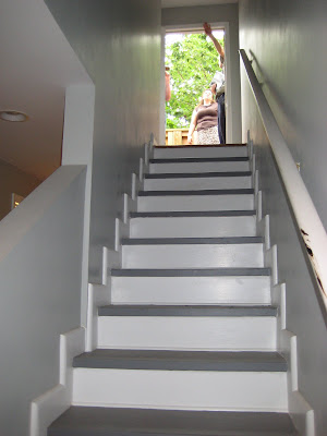
The staircase leading to the 3rd floor. The door at the topleads to the deck with views of the city skyline!

It's hard to tell, but this is a view of the master walk-in closet,an awkward space that we were concerned about outfitting. Luckily, we found a way to maximize space...more on that later.

The master bath - there's a jacuzzi tub to the right, and it has a window over it. Great for sunny mornings.


No comments:
Post a Comment