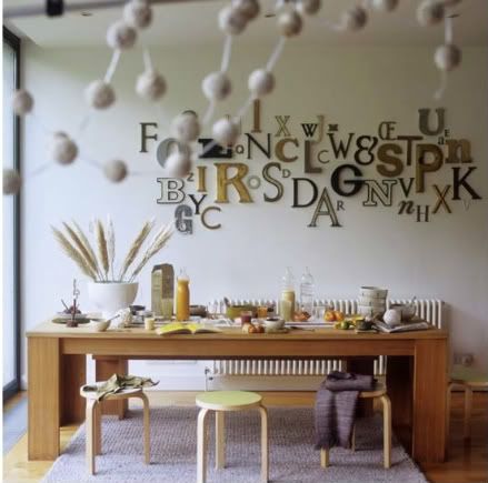

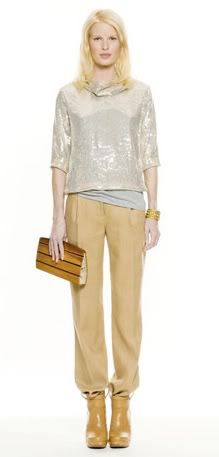
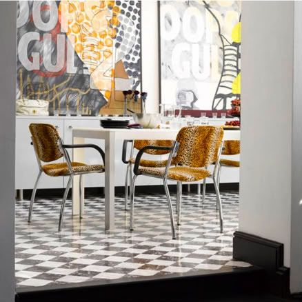
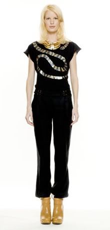
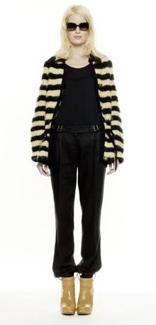
Beige, brown and black clearly do not have to be boring (especially when accented with bits of glimmer and shine), as demonstrated in these cool interiors, and in these designs from Tory Burch's pre-fall 2010 collection...
(Interior images via Canadian House and Home and Living, Etc)

5 comments:
I'm jumping on the cool neutrals with some shimmer bandwagon. Love the whole scheme be it interiors or apparel. Great post Elizabeth!
Really liked the first picture. It's quite imaginative. A pleasant mess, like my catch-all kitchen table! Thanks
Is the first picture supposed to spell something? I am guessing it isn't, but I keep looking at it thinking it should!
Haha
Loving the post! Please feel free to hyperlink any Canadian House & Home image credits to http://www.houseandhome.com/ . I know our photographers will appreciate it! Many thanks, Lisa Murphy
i think the chairs in the dining room photo are FANTASTIC...i love neutral animal prints...
rockin'!
Post a Comment