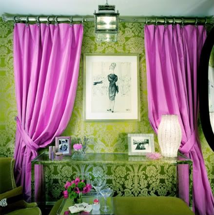
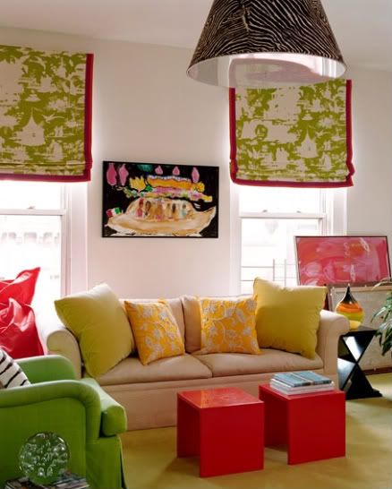
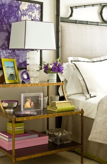
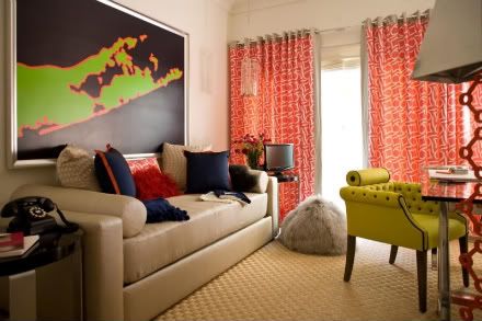
Such inspiring and unexpected color combinations in these gorgeously saturated interiors from designer Amanda Nisbet...
Amethyst, citron, petal pink and black
Persimmon, citron yellow and navy
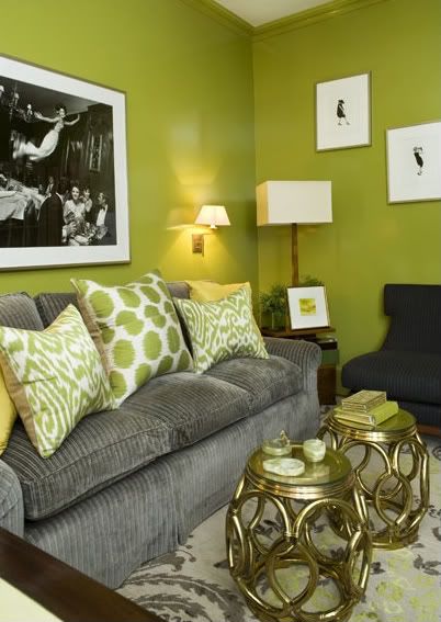
Chartreuse, slate gray, and gold
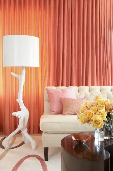
Coral, flamingo pink and buttery yellow
(Images via Amanda Nisbet Design)

10 comments:
She's really great! I love the first and the second photo in particular - the first because it's so incredibly bold; the second because it reminds me of summer (it's still cold here in Norway so I've got a craving for all things summery...)
Gorgeous! What a lovely use of color. A few of these just went into my "favorites" files!
Oh man -- so gorgeous! I love the bold color!
PS - I'm lovin' your blog! Your header is particularly fab!
love the color combo in the third pic!
You call it 'zebra', the first thing I though was 'fingerprint'. Wow, crime scene lamp huh.
These are such pretty, happy rooms. And daring use of color.
love the blinds in the second pic and the curtains in the last one. so fresh!
i absolutely love that headboard!
what pretty colors - i especially love the bottom curtains!
xox
Those pink curtains are incredible. Such a statement.
Post a Comment