4.30.2009

My Dream House

Photobucket

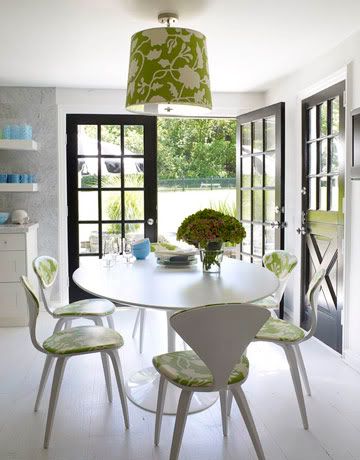
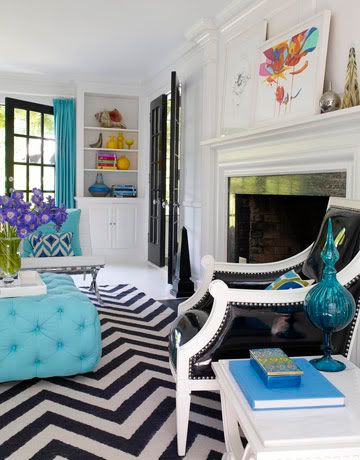
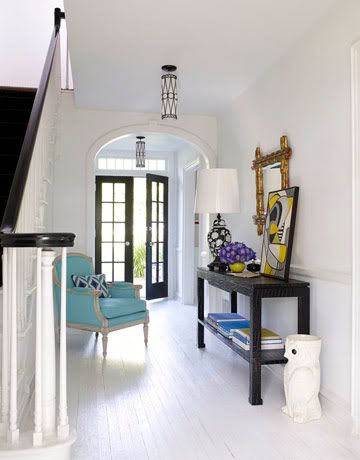
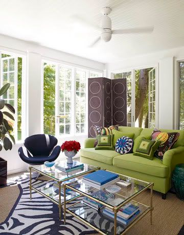
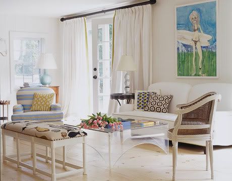
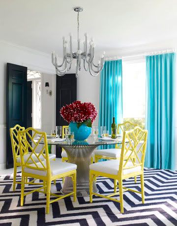
I have been obsessing over this Jonathan Adler-designed house ever since I saw it in the May issue of House Beautiful magazine. They finally posted the images on their site, and now I am sharing a few of these stunning spaces with you. They really are just too good, aren't they!?

Photobucket

Photobucket

Photobucket

Photobucket

Looking at these rooms, I take away a lot of great ideas for my own home. Like the bold white curtain rods with white curtain rings in the dining room, the black and white zig zags, the double coffee tables, and the fantastic lamp shade-style light fixture in the kitchen. The fun part for me is figuring out how to do it all on the cheap! I have some notions though, and can't wait to share them with you soon....

4.29.2009

Paradise Found

Photobucket

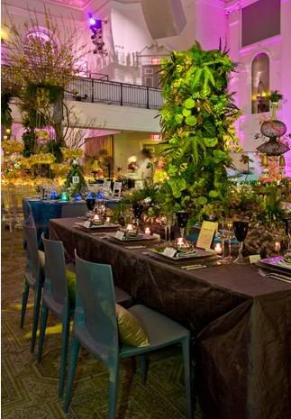
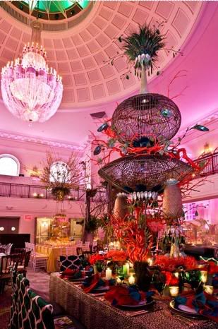
Last night I was lucky enough to attend the Horticultural Society of New York's annual Spring Gala with my great friend and colleague Colin Baer of Colin Baer Events. Colin was one of 20 decorators invited to design a dinner table for the event based on the theme "This Side of Paradise." (What a brilliant way to save money in the budget while at the same time enjoying the talents of the best florists and decorators in the city!)

Photobucket

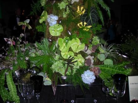
Colin asked me to work with him on his dinner table, which I was flattered and thrilled to do. Colin is so talented and I knew he would create something spectacular and original, so of course I wanted to be a part of it! The concept for our table was a modern urban paradise. We knew most of the designers would interpret "paradise" in the more expected ways, such as a tropical or island feeling, so Colin was smart enough to take it in another direction. We were picturing a super-chic roof deck dinner party with lots of lush green plants, so Colin created a four foot tall vertical garden with lady slipper orchids, flamingo flowers, succulents, ferns and a variety of mosses. And wow, did it turn out gorgeous!

Photobucket

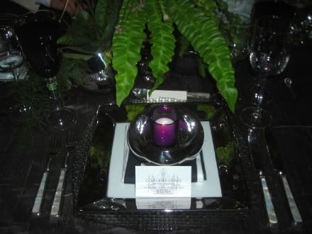
I worked with Colin to select and style the various tabletop items - furniture, linens, china, glassware, and so on. From Party Rentals we chose a gorgeous gray silk dupioni fitted tablecloth, modern glass chargers and plates, sleek mother-of-pearl flatware, black and white striped napkins (to echo a sun umbrella or window awning), and a variety of deep purple accents to pick up the petals of the orchids. I love how it all turned out!

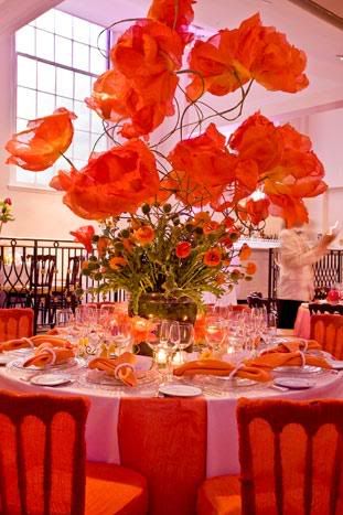
Meanwhile, there were some other fabulous tables on display, like this poppy-inspired one from the The Designers' Co-Op. Talk about eye candy! The huge flowers were all hand-made from gauze that was custom-dyed and molded...

Photobucket

Ooh, and this Asian fantasy from Bardin Palomo... check out those chair covers!

Photobucket

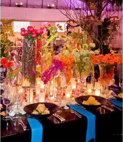
Bloom-filled vases paired with glossy black tablecloth, from David Beahm Design...

Photobucket

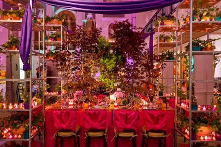
and a garden extravaganza from Flowers, Sticks and Stones...

Photobucket

What a fun night it was. Hopefully, I will have more photos to share in the future... it really was something to see. And to Colin, thanks so much for allowing me to be a part of event, and kudos for a job spectacularly well done!

All images via Biz Bash (except #2 and #3, via Colin Baer)
4.27.2009

My Weekend Outdoor Project

Photobucket

I hope you all had a great weekend! It was sunny and hot here in Philadelphia, which gave me the incentive I needed to start on the patio and deck. Most of my time was spent painting the patio fence, which went from a drab untreated wood finish to a bright white. But more on that later, once I can get some good photographs.

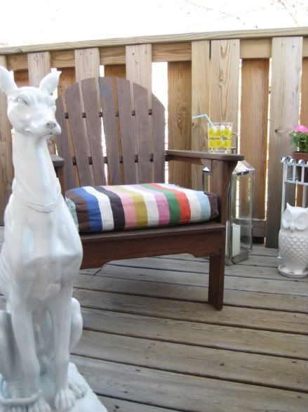
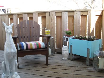
A much easier project involved sprucing up our third floor deck. It's a small space, but a perfect one for my fella and I to sit, have a cocktail, and enjoy the city skyline. We purchased the Ikea andirondack chairs last summer, along with the colorful striped cushions, though they do have similar styles this year too.

Photobucket

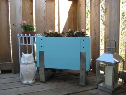
I started out by painting the Ikea planter that I've had for years and years. I blended the leftover white paint from the patio fence with a touch of turquoise paint (Valspar "Bayside") that was used on the new laundry room walls to create a dreamy aqua. The little iron plant stand was found on the street in a set of three (the other two are downstairs) - I quickly coated it with white gloss spray paint to freshen it up. Then I filled the pots with white begonias and pink petunias!
Because the deck can be viewed through a French glass door at the top of our staircase, I wanted to add some playful touches that would be fun to look at all summer. So I dragged out some fun accessories to give the space life - the chrome lanterns are from West Elm and the ceramic owl planter is from Anthropologie.

Photobucket

And so, with a cool drink in a pear-print Orla Kiely tumbler (they finally re-stocked my local Target with all the Orla kitchenware!) and Sammy the greyhound by my side, the deck is finally ready for summer living!

So, were any of you lucky enough to spend time in the sun this weekend? If so, what did you do?

Cool and Modern

Photobucket

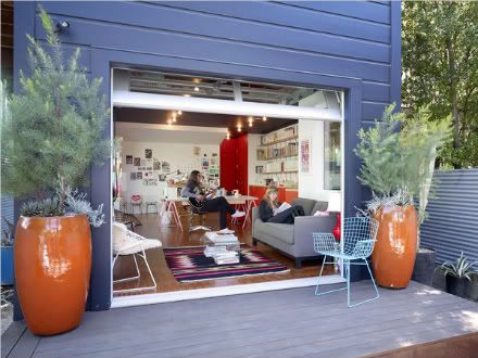
I love everything about this house! And my boyfriend would kill to have a music room like this opening up to a patio. See more here...

Photobucket

4.21.2009

The New Chandelier

Photobucket

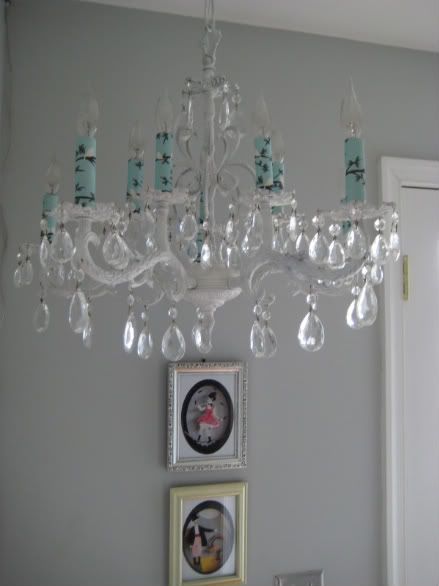
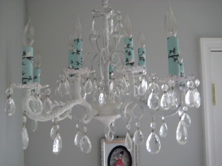
Like I mentioned yesterday, we finally hung the chandelier that I refurbished last month! I originally found it on Craigslist for $40 - it was brass and had white candle covers with fake dripping wax. Egads. But a coat of matte white spray paint brightened it up, and I created candle covers using decorative paper by Snow & Graham.

Making the candle covers was so easy! Simply purchase replacement cover tubes from a place like this (they cost around $1 each), cut your paper to size, brush adhesive onto the tube, and then place the paper carefully around the tube and smooth down. Easy as that! I think I might make a second set for my chandelier, so I can change things up from time to time.

Photobucket

The chandelier is currently residing in our third floor hallway, next to the entrance to the deck. I like that it's in a slightly unexpected place, instead of over a table or counter. Once the rest of the space is fixed up (I'm repainting the walls and adding some new pictures), I'll share some more...

Outdoor Living

Photobucket

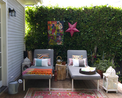
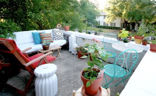
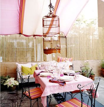
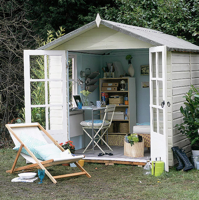
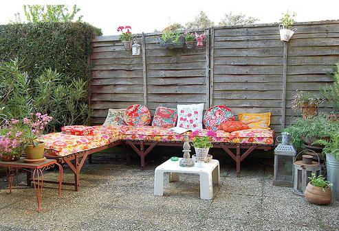
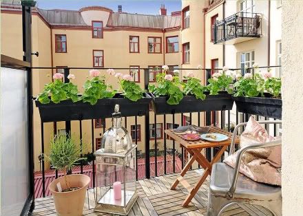
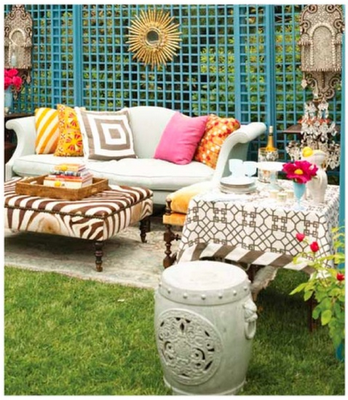
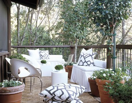
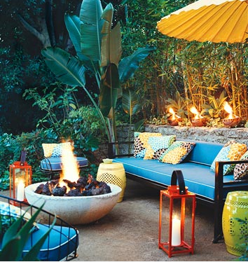
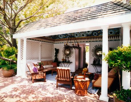
Here are just a few of my favorite outdoor living environments. These will be the inspiration for my patio and deck when I start working on them soon. I can only hope they end up looking half as good as some of these!

Photobucket
Photobucket
Photobucket
Photobucket
Photobucket
Photobucket
Photobucket
Photobucket
Photobucket

Summer Frocks

Photobucket

Photobucket


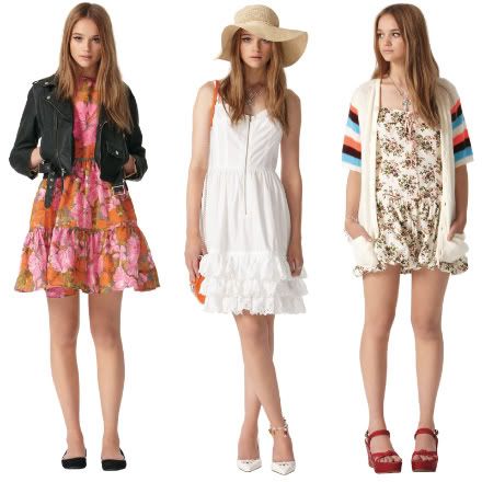
I'm a longtime fan of Tracy Feith's colorful designs, particularly in the way he mixes playful patterns. And now he can be found HERE. I promise you will be seeing me at the shore this summer wearing these looks...

4.20.2009

The Outnet

Photobucket

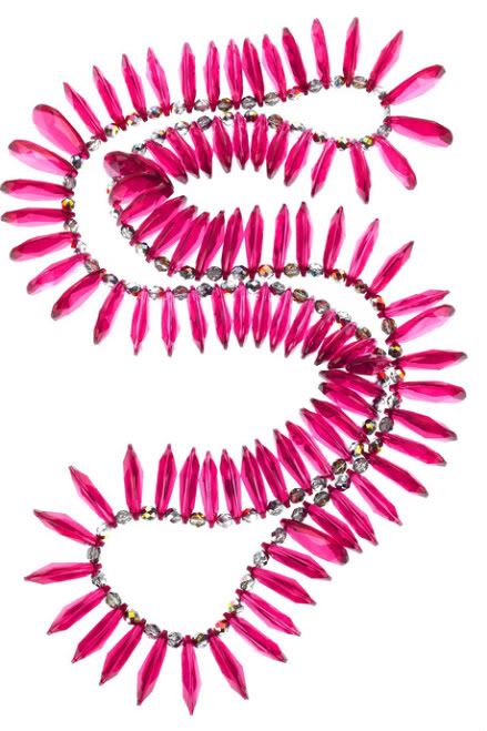
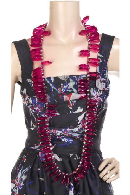
Umm, this necklace is ridiculously amazing. And I must have it. Where is it from you ask? The Outnet, Net-a-Porter's awesome new designer outlet. I've been busy perusing its pages ever since the launch late last week and can't help but love it. Unfortunately, even at a deep discount, most of the merchandise is beyond my price range. But this statement necklace (by Mawi), at $129, is the right balance of "potentially affordable" and "oh wow!" Observe how much impact it has on the dress below...

Photobucket

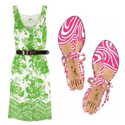
Meanwhile, I'm also enjoying some of the fun summer pieces from Tibi. I've been on a bit of a Tibi kick lately it seems, ever since I picked up two of their dresses, each with tags still attached, at a certain consignment store for less than the cost of a single sale item at H&M. Anyway, the green dress and pink patterned thongs would be the perfect combo for a sunny Sunday brunch, don't you think?

Photobucket
Have any of you checked out The Outnet yet? If so, any favorite pieces? Or do you have another favorite spot for discounted fashion? Please share!

New Laundry Room

Photobucket

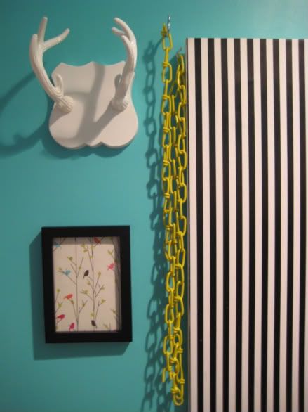
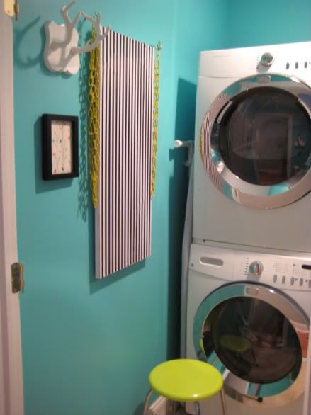
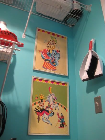
This was quite the productive weekend around my house. The new-old chandelier was hung, a ceiling fan was installed in Kevin's music room/office, and our teeny-tiny laundry room was FINALLY spruced up. After one to many times of looking at our depressing laundry and tool space, I decided to take action. The first step was a fresh coat of turquoise paint. I love how bright and cheerful it looks, and how the white appliances and shelves pop against the vivid walls. Below is a better shot of the setup of the room (please forgive the many shadows as well as the odd angles - it's a tiny space with a single overhead light which creates many photographic challenges)...

Photobucket

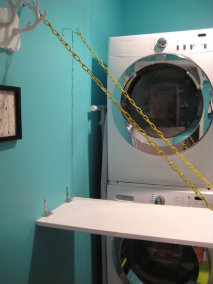
If you are wondering what the striped and chained item is on the wall, it's our solution for a folding table. Kevin simply took a pre-cut white melamine shelf (this one is from Lowe's and measures 16" x 36"), attached hinges and eye hooks, and used these plastic-coated metals chains to attach. The yellow chains are so glossy and playful, and such a great accent color to the blue walls. The stripes come from a piece of wrapping paper that is adhered to the back of the board with adhesive craft spray. Here it is descended from the wall...

Photobucket

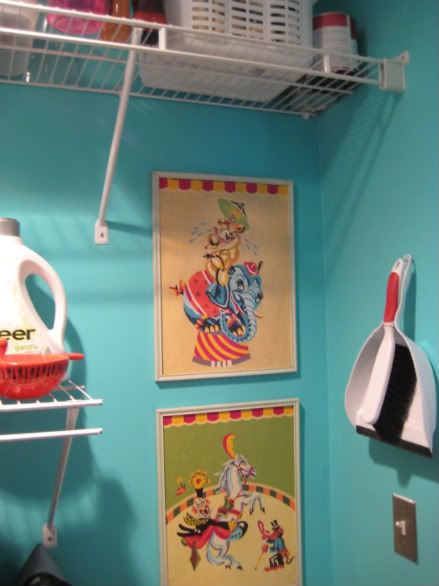
Now I can unload the dryer and place my freshly folded towels and sheets on this convenient work surface! As for the other side of the space, we have a set of wire shelves holding linens, cleaning products and tools. I've been looking for a place to hang my circus paint-by-numbers ever since we moved in. They have been with me since I moved to Philly 15 years ago, so I am glad they finally have a home in our new house.

Photobucket

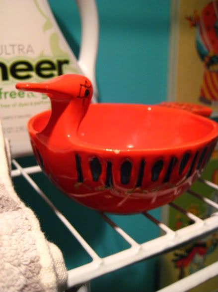
Oh, this little fella holds coins and bobby pins that I find in our pockets or at the bottom of the washing machine...

Photobucket

Photobucket

It feels so great to have a truly organized space that is fun to look at. And with these improvements, hopefully doing laundry won't be so much of a chore!

So, what did you do this weekend?

(P.S. The white antlers are from Urban Outfitters, the wall color is Valspar 5006-10A "Bayside," and the metal stool seat color is American Accents "Sour Apple" by Rustoleum)

4.14.2009

Finally... a greyhound!

Photobucket

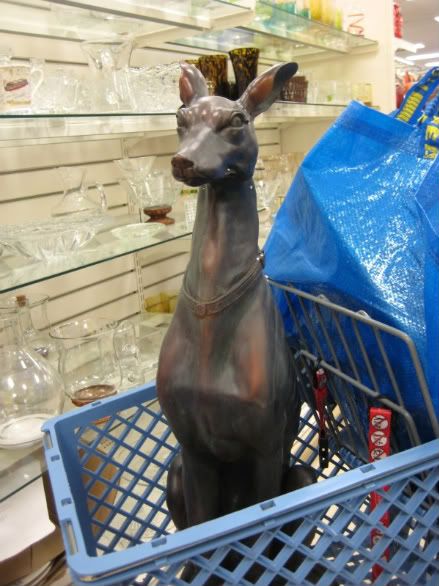
Dear Stockers of the Junky Clearance Shelves at HomeGoods:

Thank you for hiding this treasure amongst the broken candlesticks, tapestry-covered photo albums, and crystal faerie paperweights. I have been wanting a greyhound FOREVER! He is so tall and handsome, and will look perfect sitting (somewhere) in my house. As soon as it stops raining outside, I'm going to paint him glossy white so he can start his new life all fresh and bright. What a great addition he will be to our home. So thanks, HomeGoods... oh, and please let me know if you get another one so I can have a matching pair!

xo
Elizabeth

Beach House Living, Part 2...

Photobucket

Photobucket

Photobucket

Photobucket

Photobucket

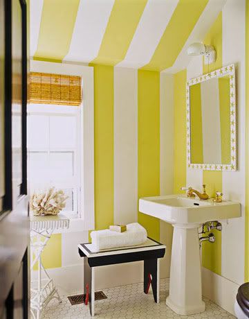
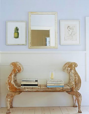
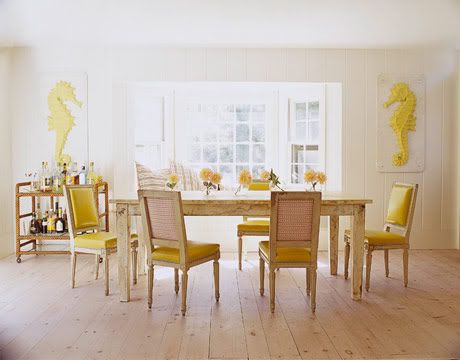
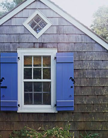
Love this beach house designed by Richard Keith Langham... especially the yellow striped bathroom and the recurring seahorse motif...

Via House Beautiful

feathers...

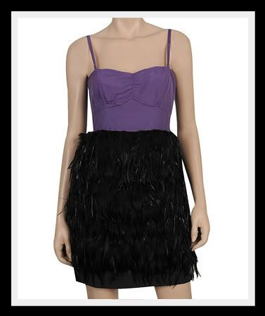
While in NYC last week, I made a quick stop in Forever 21. The store in Soho carries the Twelve by Twelve line, which is slightly more fashion-forward (and high-priced too.) I was SO tempted to try on this dress, but my aching feet didn't feel like waiting for a dressing room. Now I'm kind of regretting it...

Photobucket

Let me first say that the purple bustier half of the dress is not my thing at all. But the black feathered skirt is fantastic! And for $59, it would add a TON of high fashion to my closet for not a lot of cash. I would cover the bustier with something neutral and maybe a little more casual, like a simple gray cardigan. Or maybe a cropped leather jacket...

Photobucket

I've been loving this image via The Sartorialist for a while now. A feather skirt for with leather and leggings is just too cool. I'm not sure if I could get away with it during the day in Philly, but for drinks and dinner it would be perfection!

4.13.2009

Dressed to the Nines


Check out this gorgeous hotel called The Nines in Portland, Oregon. One of my loyal readers, Meredith, sent these pictures to me and said they looked like a place I would love. And do I love it! Who wouldn't? Turquoise velvet...creamy draped curtains...white marble vanities... pure gorgeousness, don't you think!?

My fella and I have been talking about how fun it would be to take a trip to Portland to visit the many local breweries, wineries and distilleries (Kevin is quite the talented beer brewer). Now I really hope it happens just so we can stay at this lovely hotel!

Images via Starwood Hotels